
Introducing the Polyglot Code Explorer
If you want a quick look at the explorer, you can see a simple demo here or a more complex one here. There is also a documentation site at https://polyglot.korny.info (currently a work-in-progress).
Welcome to the Polyglot Code Explorer
The Polyglot Code Explorer is an open-source tool for visualising complex codebases written in multiple programming languages.
In this article I am going to explain its purpose, how you can run it yourself, and what it does.
What is it for?
Fundamentally, I wanted to answer the question:
How can we visualise large codebases without needing complex language-specific parsers and logic?
Partly I wanted to easily spot toxic code - my colleague Erik Dörnenberg wrote some great articles on Toxic code visualisation and I wanted a way to spot some of these problem areas myself.
But also, I just wanted to be able to explore the code quickly. I’m a visual thinker, so my main focus is on visualisation - especially when trying to spot patterns in millions of lines of code.
It is far quicker for me to look at a diagram and see some unusual colouring in one area, than to see the same information in a table of numbers.
Why polyglot?
Polyglot means “speaking multiple languages” - in this case, it means these tools should work, to some degree, for any text-based programming language.
I’ve worked in many programming languages over the years, and a lot of them don’t have good or easy code quality tools - either they are too new for a community to have built them, or they are from ancient projects where even if such tools exist, getting them up and running is a headache. And each tool probably produces different metrics in different formats - it’s hard to get any sort of big-picture view.
Also many real world systems don’t use a single language - often it is better to use specialist languages for different tasks, rather than one general-purpose one. For example one project might have a UI built in JavaScript and HTML, a microservice built in Kotlin and a platform automation tool build in Rust.
Also I was inspired by reading Adam Tornhill’s book “Your code as a crime scene” - he talks about all the things you can learn from really simple metrics like lines of code, and indentation, and change history. None of these need a complex language parser - and complex language parsers tend to be touchy and flaky. Most of my code uses no language parser at all, or just a very simple which can distinguish code from comments.
And finally - supporting all the various languages out there is a lot of work! Quite a few of the other tools I found linked from Erik’s articles, and elsewhere, seem to have parsers for a number of languages - but progress is slow, and often they don’t keep up with new languages or language changes. Staying largely language-agnostic makes it much easier for me to maintain my code, and not have to worry about it stagnating.
How to run the Explorer
The explorer is actually the front end component of three tightly coupled applications:
- The Polyglot Code Scanner is a rust application, which scans the source code and produces a JSON data file
- The Polyglot Code Offline Layout tool is a node.js script which adds layout information to the JSON data file
- The Polyglot Code Explorer is a react/D3 web app which provides the user interface for exploring the code
The code is open source, you can find it on GitHub:
- https://github.com/kornysietsma/polyglot-code-scanner
- https://github.com/kornysietsma/polyglot-code-offline-layout
- https://github.com/kornysietsma/polyglot-code-explorer
I should add a disclaimer - I am not a rust guru, and I am definitely not a react guru! This is side project code, not commercial-quality - it may well have bugs, mistakes, ugliness, and it has far less testing than I’d usually expect :)
You may prefer to run these tools from source code - not all the executables have been tested on all platforms! There are some more detailed how-to guides on the docs site if you want to build them yourself, or need more details than the brief instructions below.
Getting the executable files
Each of the tools is packaged up as an executable file - the Scanner is written in rust, so it’s easy to just compile a binary. The Layout app is a node.js script, I’ve used pkg to build a bundled executable. And the Explorer can be run as a static website, so the packages are a zipped up bundle of all files needed to build the website, which you can run yourself.
- Scanner executables can be downloaded from https://github.com/kornysietsma/polyglot-code-scanner/releases
- Layout executables can be downloaded from https://github.com/kornysietsma/polyglot-code-offline-layout/releases
- Explorer bundles can be downloaded from https://github.com/kornysietsma/polyglot-code-explorer/releases
If you are on a Mac you will need to strip Apple’s quarantine attributes from the binary files to avoid the “app is from an unknown developer” error:
tar zxf polyglot-code-scanner-vwhatever-x86_64-apple-darwin.tar.gz
cd polyglot-code-scanner-vwhatever-x86_64-apple-darwin
xattr -d com.apple.quarantine polyglot_code_scanner

unzip polyglot-code-offline-layout-macos.zip
xattr -d com.apple.quarantine polyglot-code-offline-layout
The Explorer is not an executable file - it’s a zip file containing the HTML, CSS and JavaScript files needed to run the site. You can run them locally by running a tiny web server yourself using Python - there are more detailed instructions here or there’s a big list of similar servers in other languages here - I’ll use Python 3 below.
Running them
A short sample of running these together might help:
$ cd ~/work
$ polyglot_code_scanner --coupling --years 3 -o my_project_1.json ~/src/my_project
# this can be slow for big projects, or if you scan back through many years of history
# coupling is optional, remove --coupling to speed it up if you don't want it
# Check there are no errors and the my_project_1.json file is there

$ polyglot-code-offline-layout -i my_project_1.json -o my_project_2.json
# this can be slow for big files
# Check there are no errors and the my_project_2.json file is there

# the first time, you need to unzip the explorer files
$ unzip ~/downloads/polyglot-code-explorer.zip
Archive:  polyglot-code-explorer.zip
   creating: polyglot-code-explorer/
$ cp my_project_2.json polyglot-code-explorer/data/default.json
$ cd polyglot-code-explorer
$ python3 -m http.server
Serving HTTP on 0.0.0.0 port 8000 (http://0.0.0.0:8000/)
Then open a browser to http://0.0.0.0:8000 to start exploring!
Using the UI
The Explorer front end looks somewhat like this:
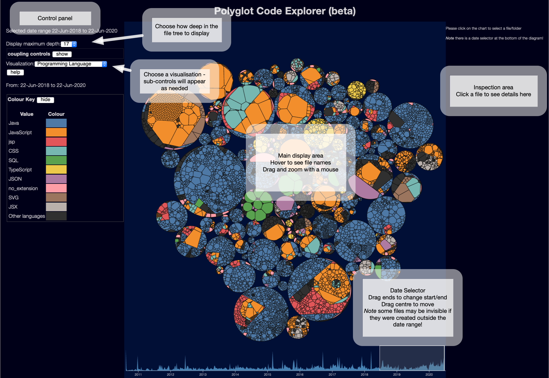
There is more about how to use the UI on the docs site
The centre of the display shows the files in your project - I’m using a Weighted Voronoi Diagram which has the big advantage of showing files roughly in proportional to their size. And by size I’m using lines of code, which is generally much more useful than bytes - especially as research tends to show that high lines of code is correlated with complexity and defects - so just looking for large lines of code is a good starting point for finding problems.
Viewing by programming language
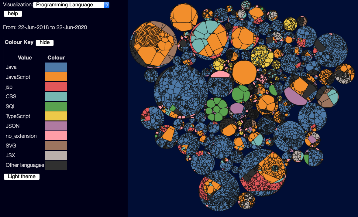
This view is very simple - it just colours each file by programming language, showing the 10 most common languages. Mostly useful for getting an overview of what goes where - it’s usually easy to spot the front-end vs back-end code by the colours used. (only 10 languages are shown because beyond that, it’s hard to visually see different colours)
Lines of code
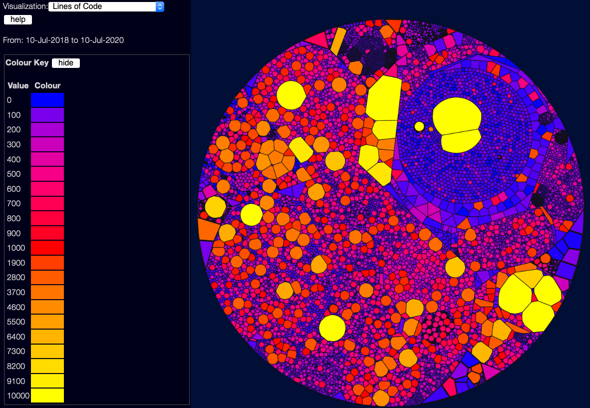
This view is simple enough - it uses a scale from blue for tiny files, through to yellow for giant files.
Note that this is not a linear scale - a lot of these use what I call a “Good/Bad/Ugly” scale - blue (0) is good, red (1000) is bad, and yellow (10000 and above) is just ugly. If I used a linear scale, it’d be harder to distinguish the good/bad files from each other. (yes, I could use a log scale, but that has it’s own problems)
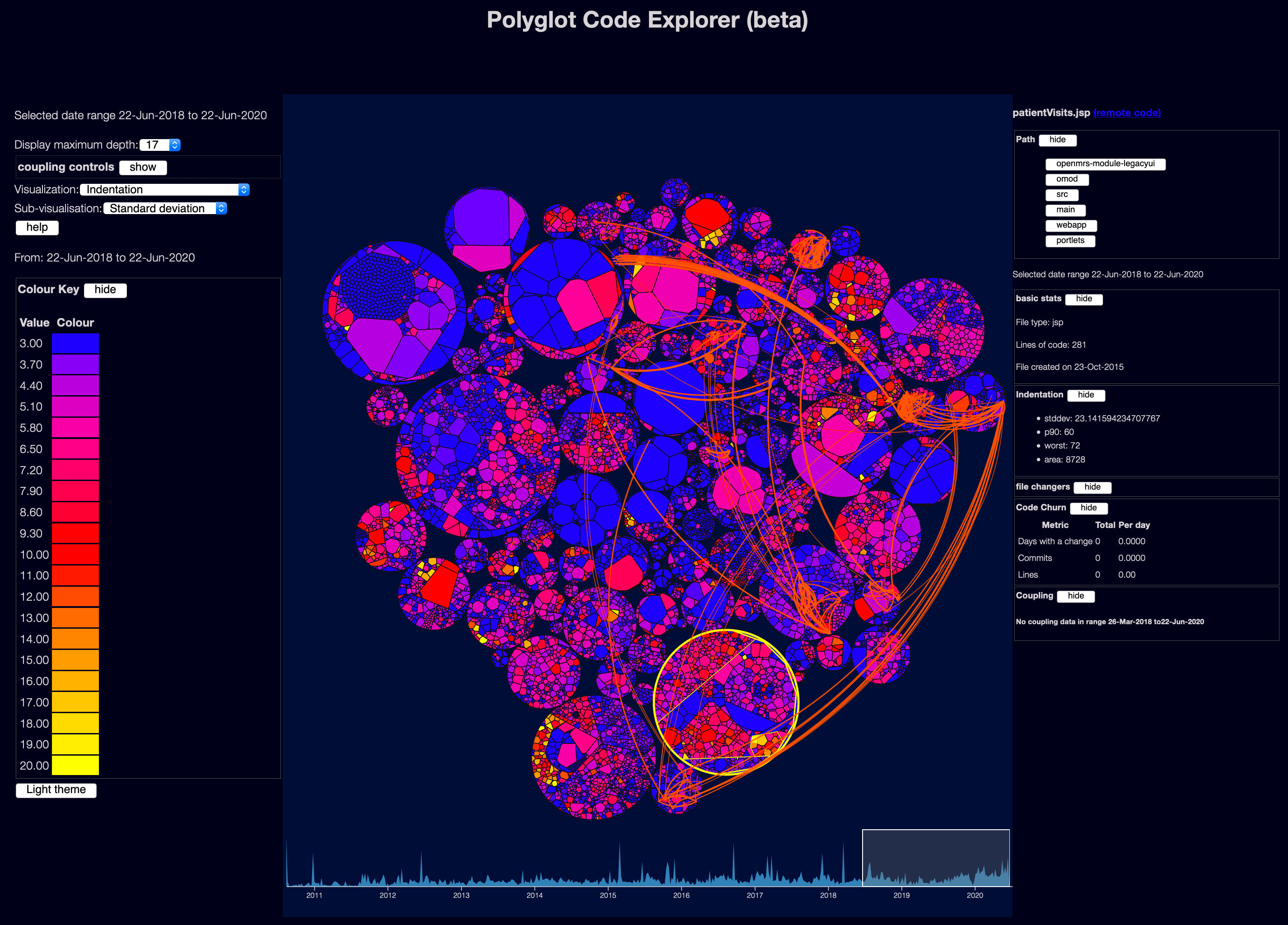
Indentation
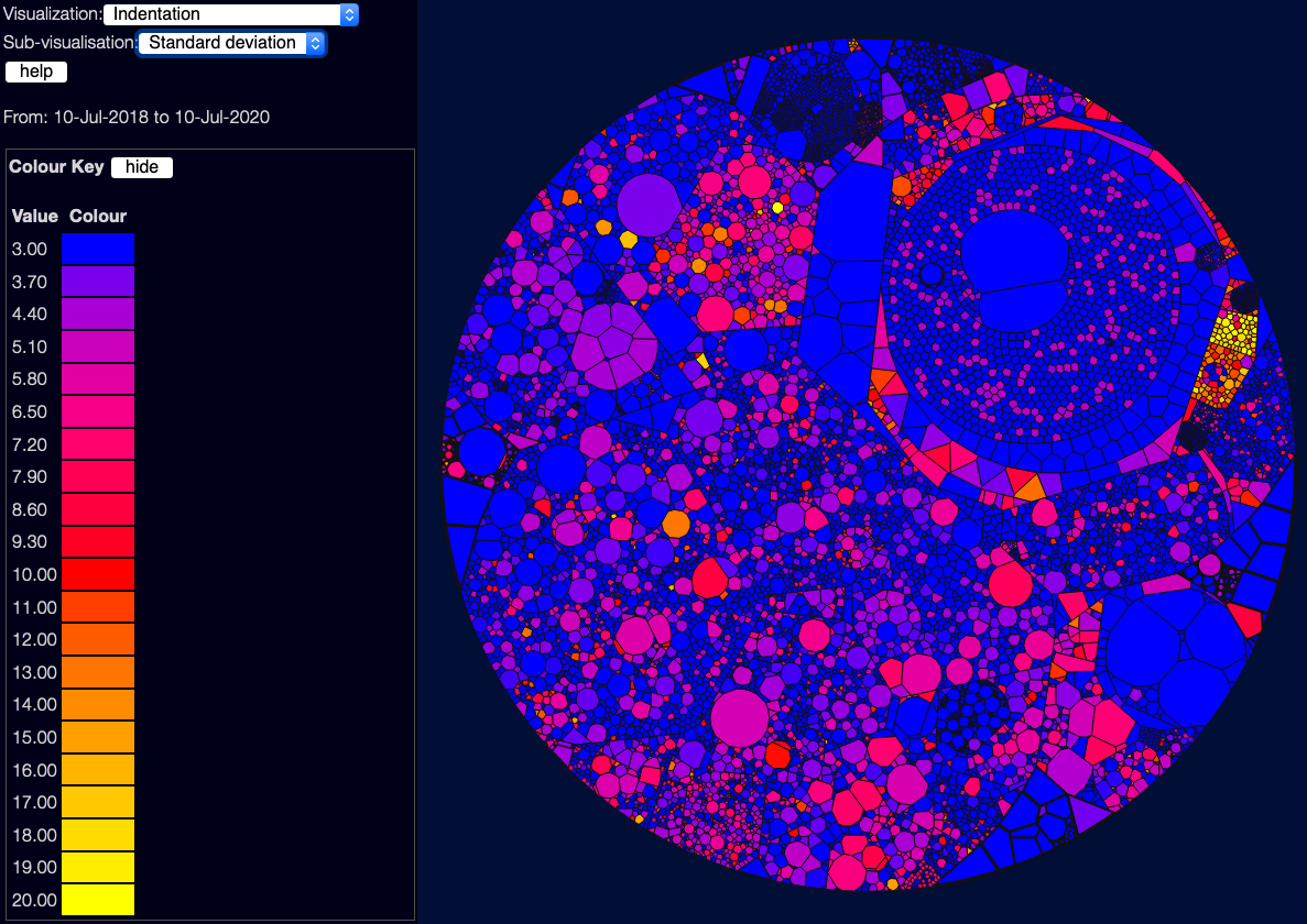
This metric is an interesting one. In Hindle, Abram, Michael W. Godfrey, and Richard C. Holt. 2008. ‘Reading Beside the Lines: Indentation as a Proxy for Complexity Metric’ they found that indentation is often useful as a way of looking for complexity - which makes common sense; files with a lot of indentation are often files with deeply nested “if” and “case” statements. You can choose a few sub-visualisations using the drop-down near the top-left - the default shows the standard deviation of indentation, which is often the most useful metric; you can also see the worst indentation in each file, and the “total area” which is useful for showing files which are both large and deeply indented.
Of course this metric can have false positives - heavy indentation might be due to a particular formatting style for long lines, or an actually valid data structure, or other valid reasons. But it is often surprisingly useful.
Age since last change
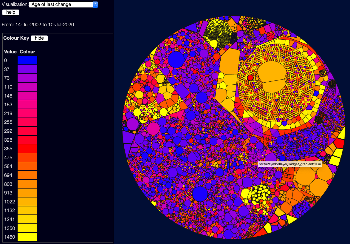
This view shows how long it is since each file was changed (from git history) - blue files are recently changed, red files haven’t changed in a year, yellow files haven’t changed in 4 years. Note that this is affected by the date selector down the bottom of the page:
Files that haven’t changed at all in the selected date range will show in grey. You need to select the whole project (drag the left side of the selector to the left of the screen) to see change information across the whole scanned date range.
This is a good/bad/ugly scale again, largely because generally files that haven’t changed for a long time are, in my experience, parts of the system that nobody understands or feels safe to touch.
However this is a bit contentious - it depends a lot on the culture of the organisation, and the kind of code - a lot of research in this field shows the flip-side of this, that files that haven’t changed for ages are stable. If they had bugs, people would have touched them - so these files might be “safe”. Personally, coming from an agile world where shared code ownership is important, and rapid change is the norm, I see old untouched files as something that might show stagnation and maintenance nightmares - I think a lot of what is “good” here depends on what you are looking for.
Creation date
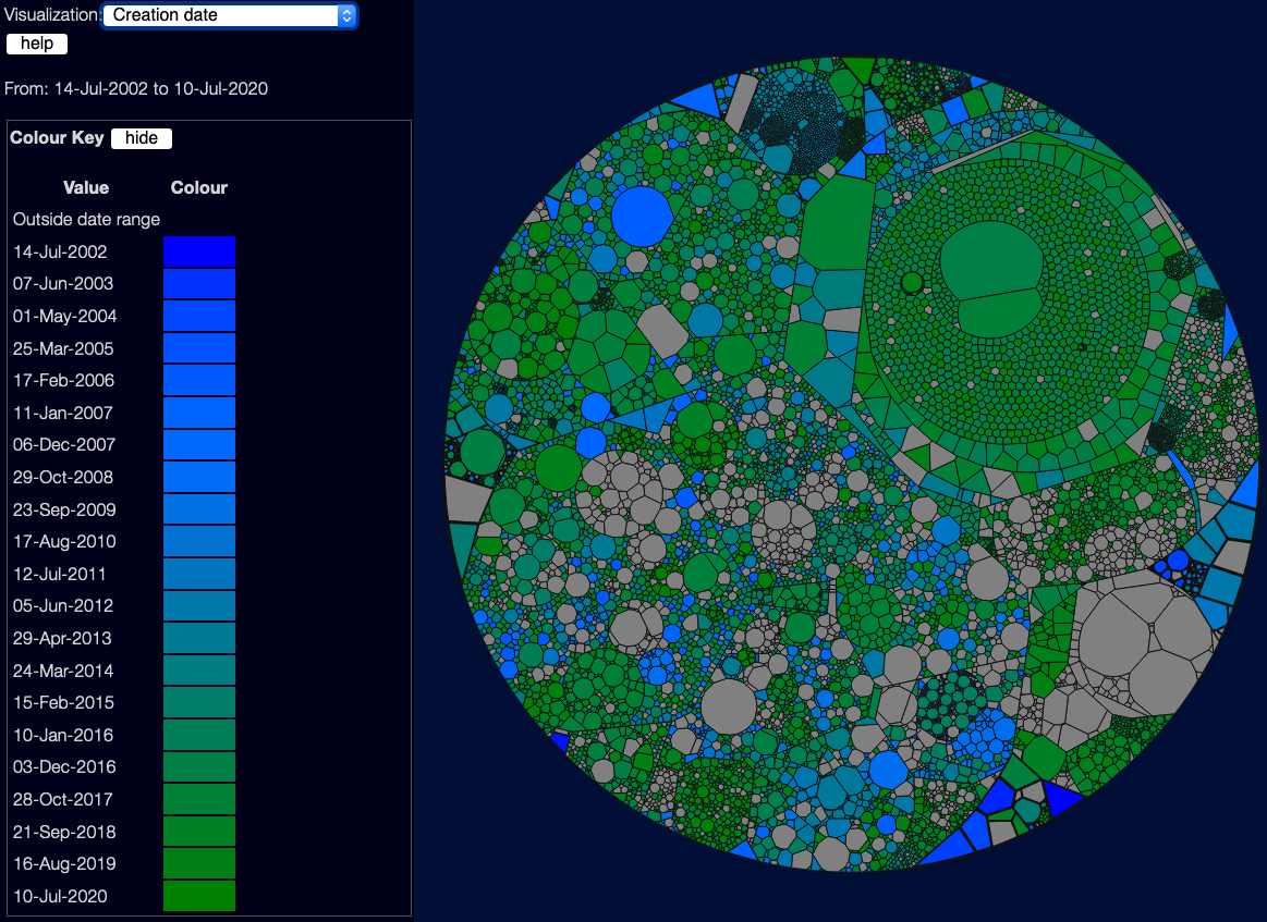
This doesn’t use a good/bad scale - it’s not really about quality, but sometimes it’s useful to know which files are new, and which are old. This is especially handy when you are using the date selector, to give you a feel for how the code has changed over time.
However, there is a problem here that requires a bit of a digression
The problem with the date selector
The scanner starts with the files currently on your filesystem - and then it works backwards in time through the git logs. It doesn’t really keep track of the actual state of your system over time, ~or file renames,~ or deleted files. If you create a file foo.c, and do a pile of work on it, and then delete it, the scanner will not show it - there’s not really anywhere in the JSON data file to store that data! ~Similarly renames are not handled well - it sees a file rename, but isn’t great at tracking what happens to the file before the rename. (This is something I plan to fix, when I can! But it’s non-trivial - you can’t just track file renames by time, you need to track them by branch…)~
Update as of scanner version 0.2.0, it does now follow renames and respect deletes. You still can’t see any files that are not in the current HEAD revision when you scan! But if you rename foo.c to bar.c it will show all changes to foo.c when you look at bar.c. This is most important if you move directories around - I’ve had to rename src/hierachy to src/hierarchy in the past!)
So moving the date selector is handy for limiting some kinds of information, and getting some views of the past - but it’s not actually a window into the past state of the project.
Unique changers
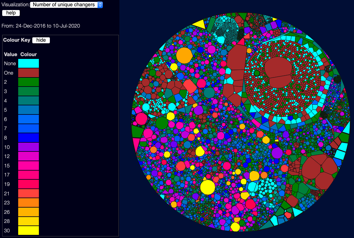
This shows how many different people touched a file, in the selected date range. Again is a bit of an “it depends” metric - some studies show that few changers are good, as they tend to be just experts and not new inexperienced people. But again, too few changers can be a sign that only one person knows a piece of code, so you don’t have any collective code ownership, and if that one person leaves, you might have some unknown code. (There’s some really interesting research in this area, which I’d love to look into in the future - such as looking at how new/old each changer is to the organisation, how long they’ve been touching this area of the code, and the like).
This has a custom colour scheme because it’s not as simple as good/bad. Basically:
- No changers is bad, so it’s highlighted in cyan. This probably means that no-one currently understands the code at all.
- One changer might be OK, though I’d see it as an ownership risk. This is shown in dark red.
- Two to Eight coders is, in my view, generally OK. This is a “two-pizza team” - it’s fine for the whole team to be changing a file.
- Eight to 30 coders is definitely risky - maybe the file is tightly coupled with several areas of code, or full of bugs so people keep needing to fix it. High numbers are in brighter colours.
Note there is one current limitation here - the system treats unique user names / emails as unique individuals. So if you change email or git account, you will look like two people. I plan to add some way to flag duplicate names - possibly using the pretty obscure git .mailmap file format. But this is a fair way down my to-do list.
Churn
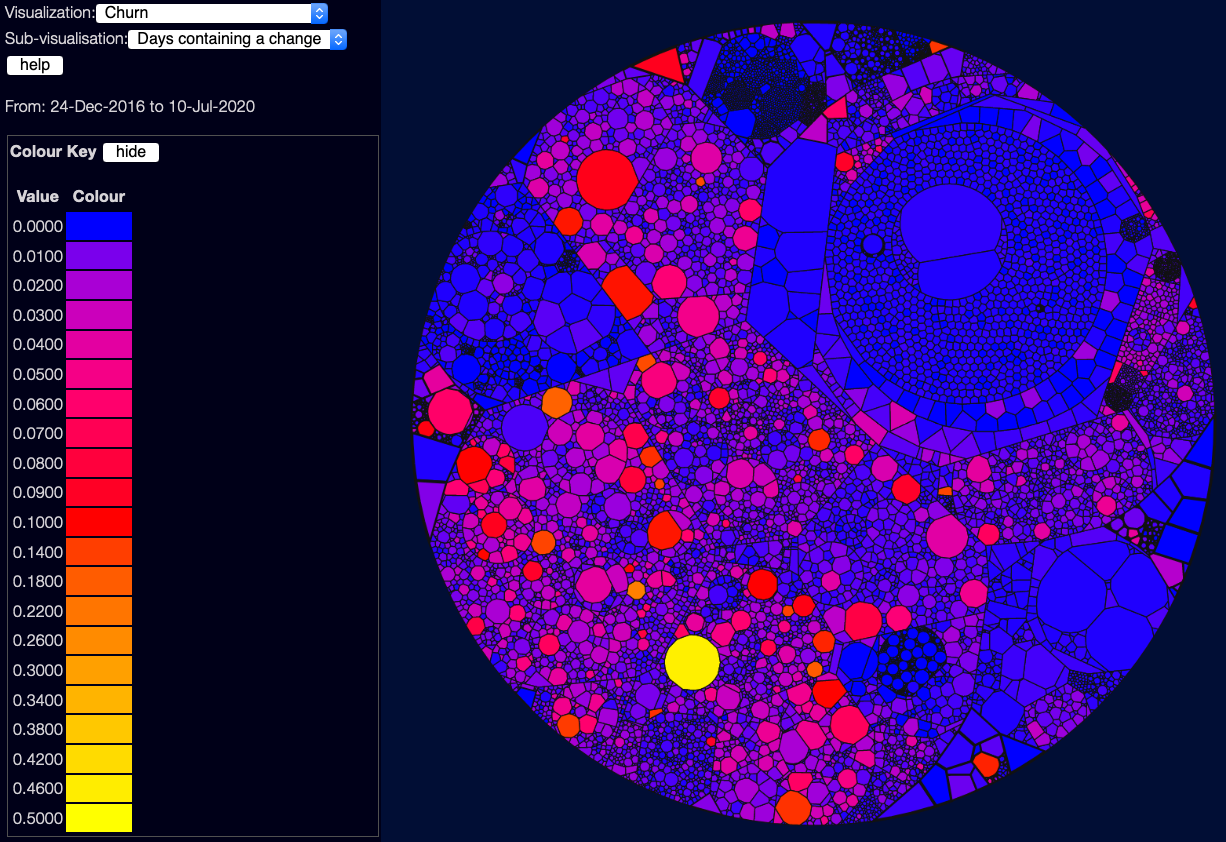
Churn shows the rate of change - how often a file has changed in the selected date window. This again isn’t necessarily good or bad - it depends a lot on what date range you are using. If a file changes every work day over several years, that’s probably bad! But if it changes every day over the course of a short project, that might be fine.
There are three sub-visualisations here:
- Days containing a change - this is in proportion to the number of days selected. So “0.5” means the file has changed every second day, on average. This doesn’t care how often in the day a file changed, so 10 commits on one day looks the same as 1 commit.
- Commits per day - this is the sum of commits, divided by the number of days. So “0.5” means on average one commit every two days - but this might mean 150 commits on one day, and none the rest of the year.
- Lines per day - this is the sum of the number of lines changed (both adds and deletes) divided by the number of days. So tiny tweaks to files won’t show up nearly as brightly as large numbers of lines added or deleted. Good for seeing where more work is being done.
Temporal Coupling
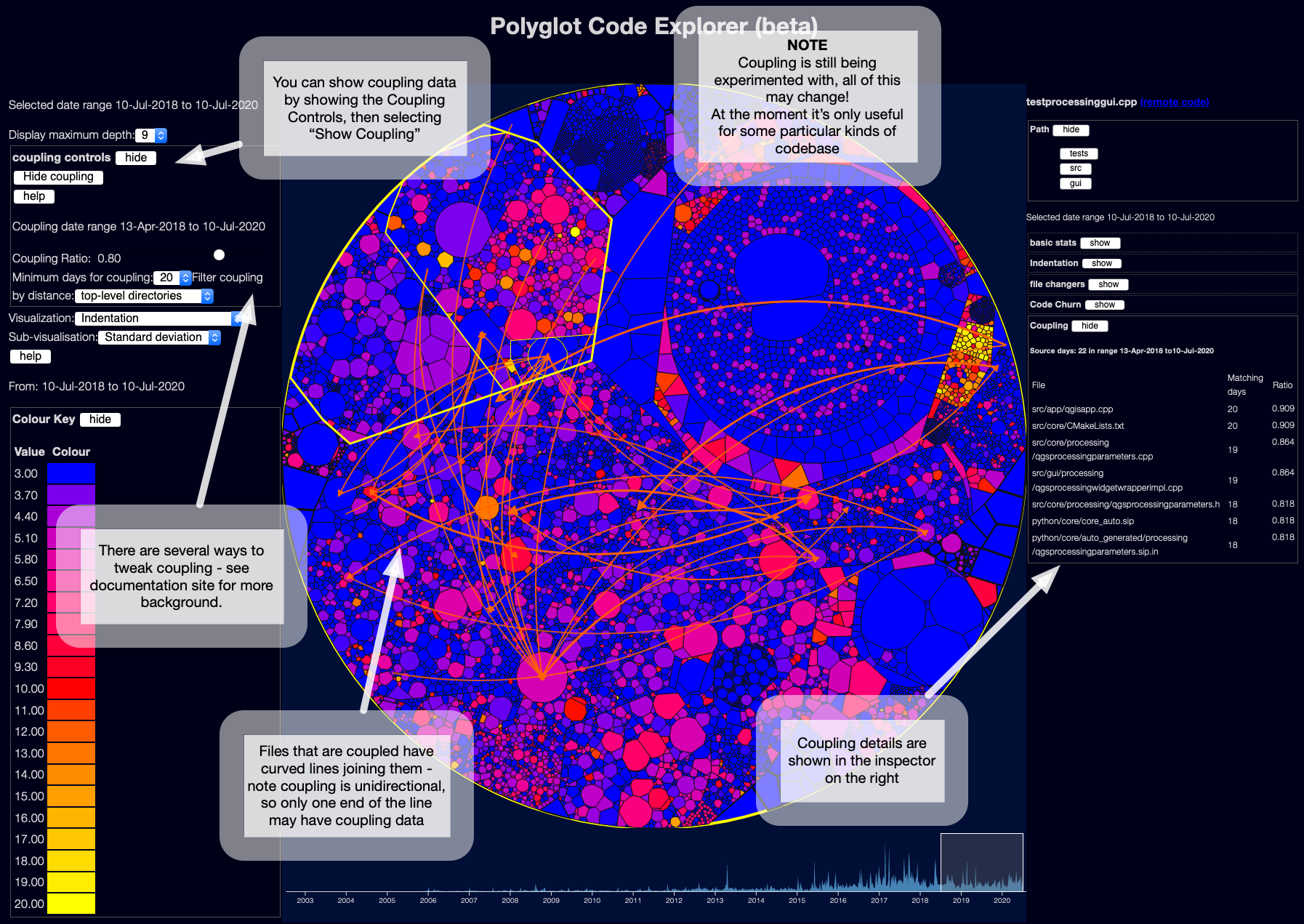
This is based on ideas from Adam Tornhill’s books, plus some research - it tries to work out when files might be tightly coupled to each other, based on when the files change in git. Adam calls this “Temporal Coupling”.
The curved lines show which files seem to be temporally coupled to which other files.
Note each line is unidirectional - file A may be coupled to file B, but file B may not be coupled to file A.
For example, in the screenshot above, the file testprocessinggui.cpp had commits on 22 days in the date range selected.
The file qgisapp.cpp was also changed on 20 of the same days.
According to the current coupling algorithm, this means it has a ratio of 0.909 - 90% of commits to testprocessinggui.cpp seem to have also implied commits to qgisapp.cpp.
The converse might not be true - qgisapp.cpp might have changed on another 20 unrelated days, so it might not have a coupling connection back to testprocessinggui.cpp.
Obviously this logic can produce a lot of false positives, if files change a lot coincidentally.
At the moment, this either produces far too many links, or far too few. I think this needs a lot of work - at minimum, it should use a much smaller time window than a day! I am probably going to try to make it changes within an hour, and see if that helps.
Most of the research in this area tracks changes within a single commit - but this doesn’t work so well for projects with lots of repositories, such as microservices projects. A huge benefit of this sort of coupling display, if it works, is to find those hidden dependencies between projects - knowing that every time you change the Foo service, you also need to change a file in the Bar service, could be very useful.
More information and further reading
I have built a documentation site for these tools, at https://polyglot.korny.info - it gives a bit more of the history of how and why I built these tools.
I also talked about this recently on the ThoughtWorks Technology podcast
Next steps
I’m keen to keep tinkering with this - I have a pile of possible enhancements, and a long list of research to read! And a lovely 3 year old child, and limited spare time :)
A few things are of fairly high priority - I’d like to handle git history renames better, projects with a lot of refactoring will have poorer quality metrics at the moment.
I’d also love to get feedback to help me prioritise - feel free to add comments on the Disqus form below, or contact me on Twitter or other social media - or for bugs / improvements you can raise issues on the linked GitHub projects.
Comments